A month ago, we highlighted creeping weakness in employment growth, some measures of consumption like retail sales and new home sales data. This was a watch out for future months.
The good news is that consumption rebounded in April: real retail sales grew 1.8% yoy (to a new all-time high) and personal consumption grew 3%. Better still, new home sales made a new 8 year high.
The bad news is that employment continued to weaken: employment growth had been 2% yoy during most of 2015. In May, that fell to 1.7% growth. As employment and wages drive future consumption, upcoming employment data will remain the key watch out.
Overall, the main positives from the recent data are in employment, consumption growth and housing:
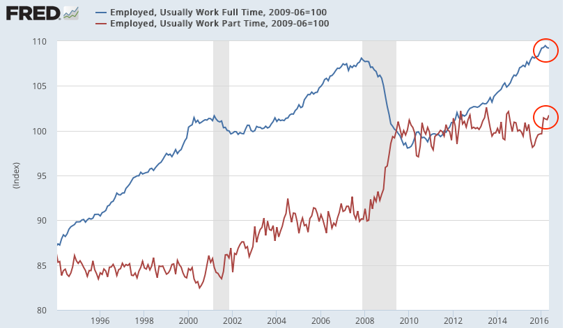
- Although employment growth has slipped, monthly gains have averaged 200,000 during the past year. Full-time employment is leading.
- Recent compensation growth is the highest in more than 6 years: 2.5% yoy in May.
- Most measures of demand show 3-4% nominal growth. Real personal consumption growth in April was 3.0%. Retail sales reached a new all-time high.
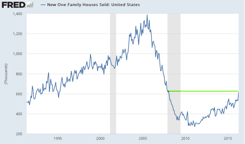
- Housing sales in April reached a new 8 year high. Housing starts are near an 8 year high but growth is flat over the past year.
- The core inflation rate ticked up above 2%, among the highest rates since 2008.
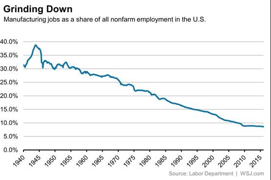
The main negatives are concentrated in the manufacturing sector (which accounts for just 10% of GDP):
- Core durable goods growth fell -4.7% yoy in April. It was weak during the winter of 2015 and it has not rebounded since.
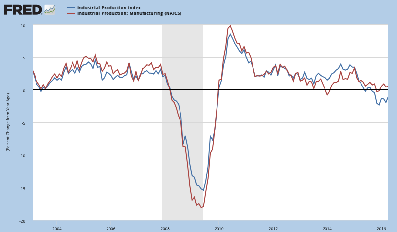
- Industrial production has also been weak, falling -1.1% yoy due to weakness in mining (oil and coal). The manufacturing component grew 0.5% yoy.
Prior macro posts from the past year are here.
* * *
Our key message over the past 2 years has been that (a) growth is positive but slow, in the range of ~3-4% (nominal), and; (b) current growth is lower than in prior periods of economic expansion and a return to 1980s or 1990s style growth does not appear likely.
Modest growth should not be a surprise. This is the typical pattern in the years following a financial crisis like the one experienced in 2008-09.
This is germane to equity markets in that macro growth drives corporate revenue, profit expansion and valuation levels. The saying that "the stock market is not the economy" is true on a day to day or even month to month basis, but over time these two move together. When they diverge, it is normally a function of emotion, whether measured in valuation premiums/discounts or sentiment extremes.

A valuable post on using macro data to improve trend following investment strategies can be found here.
Let's review each of these points in turn. We'll focus on four macro categories: labor market, inflation, end-demand and housing.
Employment and Wages
The May non-farm payroll was 38,000 new employees minus 59,000 in revisions. This was the weakest monthly report since September 2010.
In the past 12 months, the average gain in employment was 200,000.
Monthly NFP prints are normally volatile. Since 2004, NFP prints near 300,000 have been followed by ones near or under 100,000. That has been a pattern during every bull market; NFP was negative in 1993, 1995, 1996 and 1997. The low print of 84,000 in March 2015, as well as today's print, fit the historical pattern. This is normal, not unusual or unexpected.
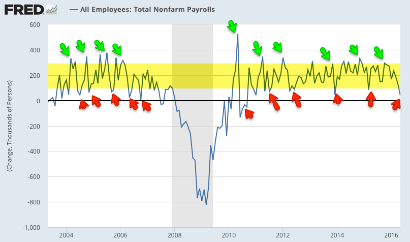
Why is there so much volatility? Leave aside the data collection, seasonal adjustment and weather issues; appreciate that a "beat" or a "miss" of 80,000 workers in a monthly NFP report is equal to just 0.05% of the US workforce.
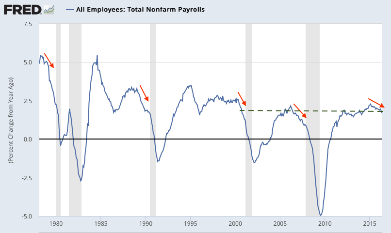
For this reason, it's better to look at the trend; in May, trend employment growth was 1.7% yoy. Until this month, annual growth had been the highest since the 1990s. Ahead of a recession, employment growth will likely markedly fall (arrows). Continued employment weakness in the next coming months is therefore a major watch out.
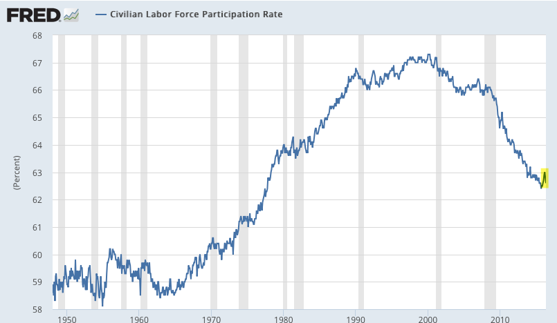
The labor force participation rate (the percentage of the population over 16 that is either working or looking for work) has been falling. This has little to do with the current recovery; the participation rate has been falling for more than 16 years. Participation is falling as baby boomers retire, exactly as participation started to rise in the mid-1960s as this group entered the workforce. Another driver is women, whose participation rate increased from about 30% in the 1950s to a peak of 60% in 1999.
Average hourly earnings growth in May was 2.5% yoy; December was 2.6%, the highest in more than 6 years. This is a positive trend, showing demand for more workers. Sustained acceleration in wages would be a big positive for consumption that would further fuel employment.

1Q16 employment cost index shows compensation growth was 2.1% yoy. This is down from 2.7% in 1Q15, which was the highest growth since the recession.

For those who doubt the accuracy of the BLS employment data, federal tax receipts are also rising (red line), a sign of better employment and wages (from Yardeni).

Inflation
Despite steady employment growth, inflation remains stuck near the Fed's target of 2%. But note: CPI and PCE are finally beginning to tick higher.
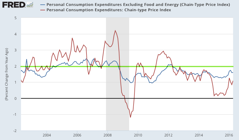
CPI (blue line) was 1.1% last month. The more important core CPI (excluding more volatile food and energy; red line) grew 2.1%, among the highest levels since 2008 but still just oscillating near 2%.

The Fed prefers to use personal consumption expenditures (PCE) to measure inflation; total and core PCE were 1.1% and 1.6% yoy, respectively, in April. Neither has been above 2% since 2Q 2012.
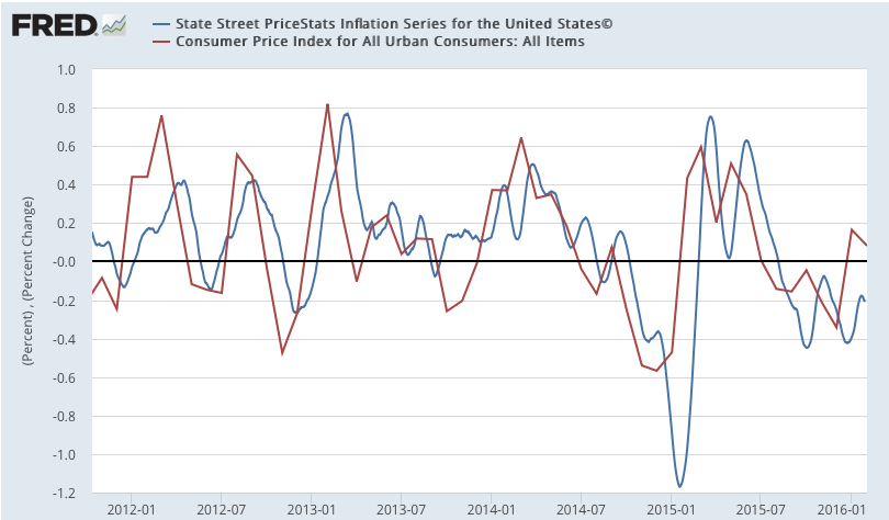
For some reason, many mistrust CPI and PCE. MIT publishes an independent price index (called the billion prices index). It tracks both CPI and PCE closely.
Demand
Regardless of which data is used, real demand has been growing at about 2-3%, equal to about 3-4% nominal.
Real (inflation adjusted) GDP growth through 1Q16 was 2.0% yoy (it was 2.9% in 1Q15, so the yoy comparable is unfavorable). 1Q growth was near the middle of the post-recession range (1.5-3.0%) but lower than the 2.5-5% common during prior expansionary periods since 1980.

Stripping out the changes in GDP due to inventory produces "real final sales". This is a better measure of consumption growth than total GDP. In 1Q16, this grew 2.3% yoy (versus 2.4% in 1Q15). A sustained break above 2.5% would be noteworthy.

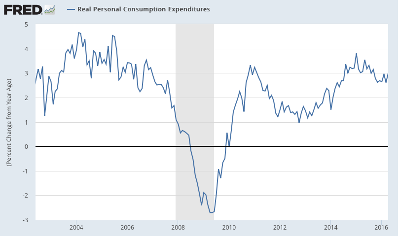
Similarly, the "real personal consumption expenditures" component of GDP (defined), the component which accounts for about 70% of GDP, grew at 2.7% yoy in 1Q16. The last seven quarters have seen the highest persistent growth rate since 2006. This is approaching the 3-5% that was common in prior expansionary periods after 1980.

On a monthly basis, the growth in real personal consumption expenditures was 3.0% yoy in April.
GDP measures the total expenditures in the economy. An alternative measure is GDI (gross domestic income), which measures the total income in the economy. Since every expenditure produces income, these are equivalent measurements of the economy. A growing body of research suggests that GDI might be more accurate than GDP (here).
Real GDI growth in 1Q16 was 2.1% yoy (it was 3.3% in 1Q15, so the yoy comparable is unfavorable). This is in the middle of the range of prior expansionary periods since 1980 (2.5-5% yoy).

Real retail sales reached a new all-time high in April, growing 1.8% yoy. The range has generally been centered around 2.5% yoy for most of the past 20 years. The latest month is near the bottom of the range.

Retail sales in the past year have been strongly affected by the large fall in the price of gasoline. Retail sales at gasoline stations fell by 9% yoy. Real retail sales excluding gas stations grew 2.9% in April. Growth has been stronger in the past year than during most of 2011-14.

The main negatives in the macro data are concentrated in the manufacturing sector, as the next several slides show. It's important to note that manufacturing accounts for less than 10% of US employment and GDP, so these measures are of lesser importance. Even within manufacturing, the weakness is concentrated; most sectors are not contracting (more on this here).
Core durable goods orders (excluding military, so that it measures consumption, and transportation, which is highly volatile) fell 4.7% yoy (nominal) in April. During the heart of the prior bull market, growth was typically 7-13%. Weakness in durable goods has not been a useful predictor of broader economic weakness in the past (arrows).
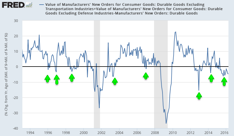
This is a nominal measure and thus negatively impacted by the fall in the inflation rate. On a real basis, growth continues to trend higher (blue line is real; gray line is nominal; chart from Doug Short).

Industrial production growth was -1.1% in April. The more important manufacturing component (excluding mining and oil/gas extraction; red line) grew 0.5%. It's a volatile series: manufacturing growth was lower at points in both 2013 and 2014 before rebounding strongly.
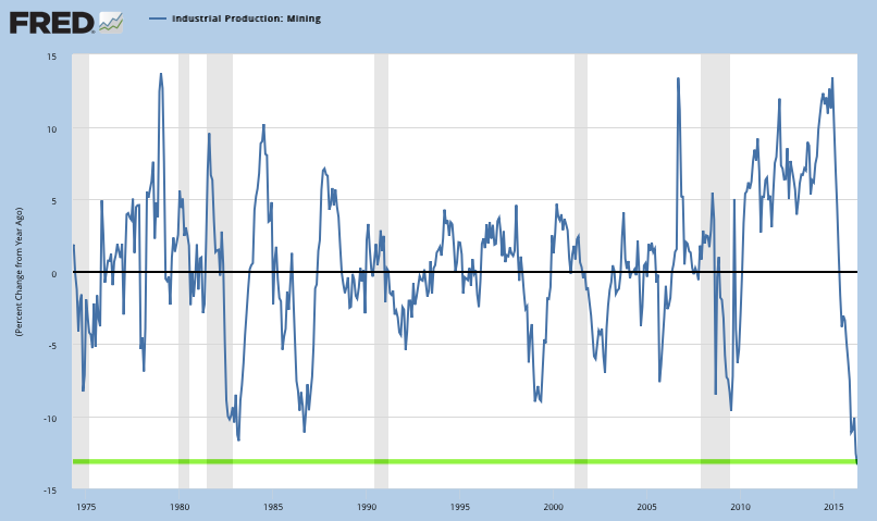
Weakness in total industrial production is concentrated in the mining sector, which fell 13% yoy in April, the worst annual fall in more than 40 years. It is not unusual for this part of industrial production to plummet outside of recessions.
Housing
Housing sales in April reached a new 8 year high. Housing starts are near an 8 year but growth is flat over the past year. Overall levels of construction and sales are small relative to prior bull markets but the trend is higher.
First, new houses sold was 619,000 in April, a new 8 year high. Growth was 24% over the past year after growing 25% yoy in April 2015.
Second, overall starts in April remained near an 8 year high but yoy growth is now flat.


Single family housing starts (blue line) were the highest since the recession in February, and only marginally lower in April. Multi-unit housing starts (red line) are flat over the past three years.

Summary
In summary, the major macro data so far suggest positive, but slow, growth. This is consistent with corporate sales growth. SPX sales growth the past year has been positive but only about 2% (nominal) excluding energy.
With valuations above average, the current pace of sales growth is likely to be the limiting factor for equity appreciation. This is important, as the consensus expects earnings to grow 1% in 2016.
Modest growth should not be a surprise. This is the classic pattern in the years following a financial crisis like the one experienced in 2008-09.

If you find this post to be valuable, consider visiting a few of our sponsors who have offers that might be relevant to you.