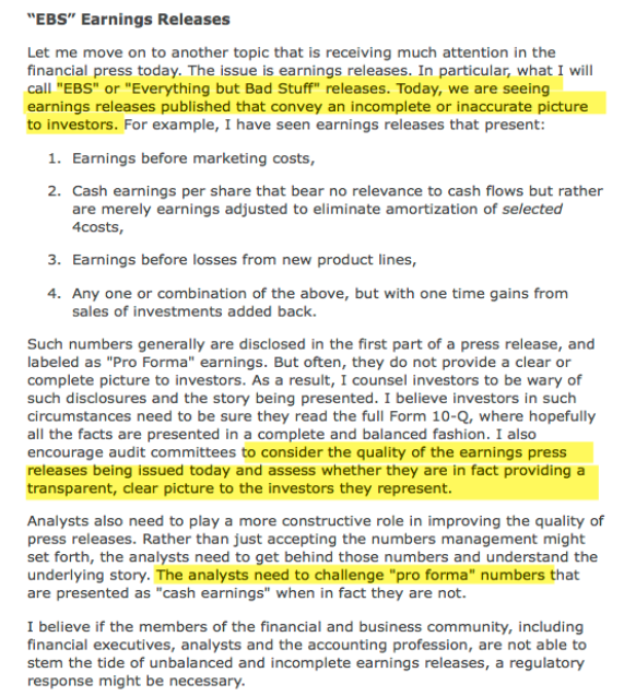
Friday, December 15, 2017

What To Expect From Equities In 2018

Summary:  US stocks will likely rise in 2018. By how much is anybody's guess: the standard deviation of annual returns is too wide to get even close to a correct estimate on a consistent basis. Earnings growth implies 6% price appreciation, but tax cuts could boost that to 13%.  Investor psychology could push returns much higher (or lower).

While it's true that investors are already bullish and valuations are already high, neither of these implies a likelihood of negative returns in 2018. That the stock market rose strongly this year also has no adverse impact on next year's probable return.

A bear market is always possible, but is also unlikely. That said, the S&P typically experiences a drawdown every year of about 10%; even a 14% fall would be within the normal, annual range.  It will feel like the end of the bull market when it happens.

The Fed will likely continue to raise rates next year, which normally leads to higher stock prices. While political risks seem high, the stock market usually ignores these. The "Year 2" presidential cycle provides no investment edge.

This article highlights 11 key ideas to explain what to expect in 2018.

* * *

Heading into the end of the year, investment pundits are beginning to share their expectations for how stocks will fare next year. All ten strategists polled by Barron's expect the S&P to rise in 2018, by a mean/median of 6-7% (full article is here; the next three charts from Barron's). Enlarge any image by clicking on it.

Saturday, December 9, 2017

Weekly Market Summary

Summary:  SPX, NYSE and DJIA made new all-time highs this week. This augurs well for the months ahead.

The leader, NDX, has fallen into a trading zone; a return to this week's low likely triggers a small correction to price levels from late October.  SPX would follow.

The big event this week is the FOMC meeting on Wednesday, during which a decision to raise the Fed Fund Rate is expected. This would be just the 4th rate increase this economic cycle. Each of the previous events was followed by a pullback in SPX and also a multi-week period where the index did not hold any gains.

* * *

SPX, NYSE and DJIA made new all time highs (ATHs) this week.  All made an inter-day ATH on Monday and closed at an ATH on Friday. For Dow Theorists, both the industrial sector and the transport sector also made new ATHs this week. The dominant trend remains higher.

SPX remains above all its moving averages, all of which are rising. This is the definition of an uptrend. It would take a break of 2620 (blue line) to trigger a head and shoulders pattern whose measured move targets the trading zone created over 6 weeks in October-November (yellow shading). Enlarge any chart by clicking on it.


Friday, December 8, 2017

December Macro Update: Housing and Manufacturing Growth At Multi-Year Highs

SummaryThe macro data from the past month continues to mostly point to positive growth. On balance, the evidence suggests the imminent onset of a recession is unlikely.

The bond market agrees with the macro data. The yield curve has 'inverted' (10 year yields less than 2-year yields) ahead of every recession in the past 40 years (arrows). The lag between inversion and the start of the next recession has been long: at least a year and in several instances as long as 2-3 years. On this basis, the current expansion will last well into 2018 at a minimum. Enlarge any image by clicking on it.


Saturday, December 2, 2017

Weekly Market Summary

Summary:  All of the US equity indices made new all-time highs this week, for the first time since mid-October.  SPX and DJIA have risen 8 months in a row. By some measures, investor sentiment is more bullish now than at any other time in more than a year, driven, apparently, by enthusiasm for tax reform legislation. The current uptrend is extended, and may be getting ready to take a short break, but further gains are likely during the first several months of 2018.

This is the set up as markets enter December, typically the strongest month of the year for equities. As bullish as December tends to be, an intra-month drawdown of 2% has been common, even in recent years.

* * *

For the first time in a month, all US indices - SPX, NYSE, DJIA, COMPQ, NDX and RUT - made new all time highs (ATHs) this week.  The dominant trend remains higher. Enlarge any image by clicking on it.


Tuesday, November 28, 2017

A Cautionary Signal After Today's Strong Gain

Summary:  US indices closed at new all time highs on Tuesday. The gain was so strong that SPX closed 25% above its Bollinger Band width. This is rare. There have been only 6 similar instances since 2003. None marked an exact short-term top in the market, but all preceded a fairly significant drawdown in the week(s) ahead. Risk-reward over this period was very poor.

There are a host of countervailing reasons to expect equities to end the year higher. This is only one data point, and the sample size is small. Nonetheless, a heads up is warranted.

In an addendum, we look at consecutive opens and closes above the upper Bollinger Band (there were 3 in a row this week). The message is the same: when SPY was not breaking out of a base, these instances have often been followed by at least temporary buyer exhaustion.

* * *

Today, SPX, COMPQ, NDX, NYSE, DJIA and RUT all made new all time highs (ATHs).  The dominant trend remains higher. Enlarge any image by clicking on it.


Sunday, November 26, 2017

The Flattening Yield Curve Is Not A Threat to US Equities

Summary:  On its own, a flattening yield curve is not an imminent threat to US equities. Under similar circumstances over the past 40 years, the S&P has continued to rise and a recession has been a year or more in the future. Investors should expect the yield curve to flatten further in the months ahead.

* * *

Investors are concerned about the flattening yield curve. Enlarge any image by clicking on it.


Friday, November 17, 2017

Path To Higher Yields In 2018 Unlikely To Be Straight Forward

Summary:  Macro economic data is good. It seems likely that rates will be higher in a year and that suggests treasury yields will also be higher than they are now. But the path between here and higher yields is unlikely to be as straight-forward as is currently believed.

* * *

Recent macro economic data in the US has been very good. In just the past month, retail sales have risen to new all-time highs, new home sales have risen to a new 10 year high and unemployment claims have fallen to more than a 40 year low. Last month, manufacturing notched an annual growth rate of 2.7%, the highest rate in over 3 years.

It would be sensible, therefore, to expect the Federal Reserve to raise its funds rate at its December 13th meeting; in fact, the implied probability of this is now close to 100%. Three further rate hikes are also expected in 2018.

Under this backdrop, investors would logically expect treasury yields to also rise.

That might well be the case, but the path is unlikely to be that straight forward.

Consider, first, that the Fed has already raised its funds rate 4 times in the past 2 years. Treasury yields were lower several weeks later every time. Enlarge any image by clicking on it.


Wednesday, November 15, 2017

Fund Managers' Current Asset Allocation - November

Summary: Global equities have risen 18% so far in 2017 and yet, until this month, fund managers have held significant amounts of cash and been, at best, only modestly bullish on equities. All of this has suggested lingering risk aversion.

That has now changed. Cash levels have fallen to the lowest level in 4 years. Allocations to global equities have risen to the highest level in 2-1/2 years. In most respects, investors are now bullish.

In the past 6 months, US equities have outperformed Europe by 10% and the rest the world by 3%. Despite this, fund managers remain underweight. US equities should outperform their global peers.

Fund managers are underweight global bonds, nearly to an extreme that has often marked a capitulation low in the past. Only 5% of fund managers believe global rates will be lower next year, a level at which yields have often fallen.

* * *

Among the various ways of measuring investor sentiment, the BAML survey of global fund managers is one of the better as the results reflect how managers are allocated in various asset classes. These managers oversee a combined $600b in assets.

The data should be viewed mostly from a contrarian perspective; that is, when equities fall in price, allocations to cash go higher and allocations to equities go lower as investors become bearish, setting up a buy signal. When prices rise, the opposite occurs, setting up a sell signal. We did a recap of this pattern in December 2014 (post).

Let's review the highlights from the past month.

Overall: Relative to history, fund managers are overweight equities and underweight bonds. Cash is now neutral. Enlarge any image by clicking on it.
Within equities, the US is significantly underweight while Europe, Japan and emerging markets are significantly overweight. 
A pure contrarian would overweight US equities relative to Europe, Japan and emerging markets, and overweight global bonds relative to a 60-30-10 basket. 


Tuesday, November 14, 2017

Solid Sales Growth and Margins At New Highs Drive 3Q17 Results

Summary: For the third quarter (3Q17), S&P earnings rose 12% yoy, sales grew 6% and profit margins expanded to new all-time highs.

These strong results are not due to the rebound in oil prices. Sales for the sectors with the highest weighting in the S&P have grown an average of 7% in the past year and 19% in the past 3 years. Moreover, margins outside of energy have expanded to a new high of 10.8%.

Bearish pundits continue to repeat several misconceptions: that "operating earnings" are deviating more than usual from GAAP measurements; that share reductions (buybacks) are behind most EPS growth; and that equity gains are unreasonably out of proportion to earnings growth. None of these are correct. Continued growth in employment, wages and consumption tell us that corporate financial results should be improving, as they have in fact done.

Where critics have a valid point is valuation: even excluding energy, the S&P is now more highly valued than anytime outside of the late 1990s technology bubble. With economic growth of 4-5% (nominal) and margins already at new highs, it will take excessive bullishness among investors to propel S&P price appreciation at a significantly faster rate. At this point, lower valuations are a notable risk to equity returns.

* * *

92% of the companies in the S&P 500 have released their 3Q17 financial reports. The headline numbers are good. Overall sales are 6% higher than a year ago, the second best growth rate in nearly 6 years. Earnings (GAAP-basis) are 12% higher than a year ago. Profit margins are at a new high of 10.2%, exceeding the prior peak from 2014.

Before looking at the details of the current reports, it's worth addressing some common misconceptions that are regularly cited.

First, financial reports are said to be fake. This complaint has been a feature of every bull market since at least the 1990s. In truth, the trend in GAAP earnings (red line) is the same as "operating earnings" (blue line; all financial data in this post is from S&P). Enlarge any image by clicking on it.


Sunday, November 12, 2017

Weekly Market Summary

Summary:  US equities continue to make new all-time highs (ATHs) and the outlook into year-end is favorable. This week's interim fall of nearly 1% followed by a strong rise into the close demonstrates the market's continued resiliency. It might also indicate waning upward momentum. There remain a number of reasons to suspect that more weakness is ahead, although this is likely to be only temporary.

* * *

SPX, COMPQ, NDX and DJIA all made new ATHs again this week (on Wednesday).  The dominant trend remains higher. Enlarge any image by clicking on it.


Saturday, November 4, 2017

Weekly Market Summary

Summary:  The major US indices closed at new all-time highs (ATH) again this week, led by the surging technology-heavy Nasdaq. SPX is now higher 7 months in a row; that level of momentum has not marked a bull market high.

Several short-term studies - using trend, sentiment, volatility and breadth - suggest a lower close than today may be ahead in the next few weeks. Any weakness is likely to be temporary.

* * *

SPX, COMPQ, NDX and DJIA all closed at new all-time highs (ATH) again on Friday.  The dominant trend remains higher. Enlarge any image by clicking on it.


Friday, November 3, 2017

November Macro Update: Recession Risk Remains Low

SummaryThe macro data from the past month continues to mostly point to positive growth. On balance, the evidence suggests the imminent onset of a recession is unlikely.

The bond market agrees with the macro data. The yield curve has 'inverted' (10 year yields less than 2-year yields) ahead of every recession in the past 40 years (arrows). The lag between inversion and the start of the next recession has been long: at least a year and in several instances as long as 2-3 years. On this basis, the current expansion will last well into 2018 at a minimum. Enlarge any image by clicking on it.


Tuesday, October 31, 2017

The End of QE Didn't Kill The Bull Market. The Start of QT Won't Either

Summary:  Quantitative Easing (QE) ended 3 years ago today. This was widely expected to mark the end to the bull market (post). Instead, US stocks have risen another 37%.

Why was this view wrong? In truth, the narrative about the Fed's policy has shifted over time as equities have risen. As late as 2012, QE was viewed as bearish. Into 2014, it was only the continued QE inflows that were considered bullish. When stocks kept rising after QE ended, the narrative shifted to the large Fed "balance sheet" and then to global central bank actions.

The Fed's policies have clearly led US equities higher, but not in the way that it has been popularly perceived. The Fed established the conditions for fundamental growth in consumption, investment, employment and corporate profits, creating the confidence in investors to place their cash into the financial markets. All of these factors have a strong causal relationship to share price that long pre-date 2009 and the QE programs.

The Fed will now embark on a reduction of its balance sheet (QT). This appears to be the most pivotal event facing markets in 2018. But it stands to reason that so long as the positive fundamental conditions continue, US equities can be expected to remain firm.

None of this implies that the US equity market will continue to appreciate without any interim drama. As noted in the charts that follow, investor sentiment is very bullish and equity valuations are very high. Since 1980, it has been normal for the S&P to correct by an average of 10% during the course of each year of a bull market. With the last correction of that magnitude starting 2 years ago, one of that magnitude, or larger, is arguably overdue in the coming months. That, not the tapering of the Fed's balance sheet, is the relevant risk for investors to focus on in 2018.

* * *

On September 20th, the Fed formally announced that it will begin to reduce its balance sheet, primarily by ceasing reinvestment from maturing bonds. This process is being termed "Quantitative Tightening" (QT) as it is the reverse of the bond buying program known as Quantitative Easing (QE).

QT will begin slowly, with a reduction of just $10b per month during the first 3 months. If there are no major market disruptions, then the pace of QT will be increased by $10b per month every quarter. To put that in perspective, $10b equals 0.2% of the Fed's total assets. By the end of the year, the Fed's balance sheet will have been reduced by less than 1% (from JPM). Enlarge any image by clicking on it.


Monday, October 30, 2017

Investor Psychology, Part III: Seeking and Avoiding Risk At Exactly The Wrong Time

Summary:  Too often, investors sell their winners early and hold on to their losers in order to avoid taking a loss. Put another way, when faced with a gain, investors avoid risk; when faced with a loss, they seek risk. It's the exact opposite of what a rational, profit-maximizing investor would be expected to do. This is another paradox of human behavior that helps explain why most investors perform badly.

Why do investors act in this way and how can this behavior be avoided?

* * *

In a recent post, we described how prominent, but rare, events are mistakenly ascribed a high likelihood. Bear markets and crashes are objectively uncommon but feature prominently in our decision making. As a result, the average investor earns a return that is barely higher than the annual rate of inflation (that post is here).

To make matters worse, active investors engage in risk at exactly the wrong time, and avoid risk when they should instead be taking it.

 Imagine you are given the choice between:
a. $1 million guaranteed, or
b. A 50/50 chance to receive either $2 million or zero. 

The expected payoff of both options is the same, but most individuals choose a guarantee of $1 million (option a) rather than a chance to win $2 million. When faced with a gain, risk is avoided.

Now imagine you are given the choice between:
c. A certain loss of $1 million, or
d. A 50/50 chance of losing $2 million or losing nothing. 

The expected payoff is once again the same for both options, but this time most individuals avoid the guaranteed loss and favor gambling in order to breakeven (option d). When faced with a loss, risk is preferred (see note at the bottom of this page).

Friday, October 27, 2017

Investor Psychology, Part II: Following The Stock Market Is Bad For Your Returns

Summary:  The irony of equity investing is this: if you knew nothing about the stock market and did not follow any financial news, you have probably made a very handsome return on your investment, but if you tried to be a little bit smarter and read any commentary from experienced managers, you probably performed poorly.

The human mind has a tendency to assess risk based on prominent events that are easily remembered. The 1987 crash, the tech bubble, the financial crisis and the flash crash in 2010 are all events that are easily recalled. The mind automatically assigns a high probability to prominent (but rare) events. It ignores the more important "base rate" probability that better informs decisions. The fact that the stock market rises in 76% of all years, that it gains an average of 7.5% per year and that annual falls greater than 20% occur less than 5% of the time, are ignored in decision making. The mind interprets every 10% correction as the beginning of something much worse, even though a 10% fall is a typical, annual occurrence during bull markets.

Bearish market commentary that highlight risk conjure gravitas. Bullish commentary often seems shallow. But remember, in the absence of relevant data, the "base rate" probability is your best guide. Conflating prominent, but rare, events with high probability is an ongoing impediment to better investment returns. Recognizing this inherent deficiency in our decision making is perhaps the biggest potential source for improvement for most investors.

* * *

In the past 12 months, the S&P has returned 22%. In the 3 years since the end of QE3, the total return is 37%. In the past 5 years, returns are over 100%.

Yet, throughout this period, investors with even a passing interest in financial news have regularly seen commentary from experienced managers that the stock market is highly likely to plunge now (from Daniel Miller). Enlarge any chart by clicking on it.


Sunday, October 22, 2017

Investor Psychology, Part I: Using Time, Scaling and Inflation to Frame Data (and Mislead Readers)

Summary:  How data is presented has a significant affect on the conclusion a reader will draw. Behavioral economists call this framing: "what you see is all there is." Presented below is a mental trick used to mislead readers.

* * *

Over the past 85 years, the S&P stock index has grown 35,600%. The rise looks parabolic. The conclusion appears to be that it is unsustainable (data from Robert Shiller).


Friday, October 6, 2017

October Macro Update: Hurricanes End 83-Month Employment Expansion

SummaryThe macro data from the past month continues to mostly point to positive growth. On balance, the evidence suggests the imminent onset of a recession is unlikely.

The bond market agrees with the macro data. The yield curve has 'inverted' (10 year yields less than 2-year yields) ahead of every recession in the past 40 years (arrows). The lag between inversion and the start of the next recession has been long: at least a year and in several instances as long as 2-3 years. On this basis, the current expansion will last well into 2018 at a minimum. Enlarge any image by clicking on it.


Saturday, September 30, 2017

Weekly Market Summary

Summary:  The major US indices traded at new all-time highs (ATH) again this week, led by surging small cap stocks. SPX is now higher 6 months in a row and 10 of the past 11 months; that level of momentum has never marked a bull market high.

Short-term optimism has reached an extreme that has resulted in a lower weekly close within the next 6 weeks every time over the past 5 years.

The fundamental narrative for the current rally is that the Trump administration's tax plan will boost earnings by an estimated 6%. If investors expect the tax plan to also cause economic growth to accelerate, then they are very likely to be disappointed.

* * *

SPX, COMPQ, RUT and NYSE made new all-time highs (ATH) again this week.  SPX has been up 5 of the last 6 weeks. The dominant trend remains higher. Enlarge any image by clicking on it.


Sunday, September 24, 2017

Weekly Market Summary

Summary:  The major US indices all traded at new all-time highs (ATH) this week. Even the lagging small caps index closed at a new ATH on Friday, and transports are very near a new ATH. Persistent strength like that seen throughout 2017 has almost always continued into year-end. However, like last week, a few studies suggest short-term upside will likely be limited. The third quarter ends on Friday.

* * *

US equities are now in the second longest and second strongest bull market of the post-war era. Enlarge any image by clicking on it.


Friday, September 15, 2017

Weekly Market Summary

Summary:  The major US indices all recorded new all-time highs (ATH) this week. The very broad NYSE, covering 2800 stocks, also made a new ATH, suggesting the rally is supported by adequate breadth. Longer-term studies and the fundamental macro data continue to indicate that further upside into year-end is odds-on. Remarkably, a new survey shows that fund managers are the most underweight US equities in 10 years, despite the SPX rising 9 of the last 10 months by an impressive 17%.

On a short-term basis, there are several reasons to be on alert for weakness over the next week or two.    An important FOMC meeting is on deck for Wednesday.

* * *

US equities remain in a long term uptrend. SPX, DJIA, NYSE, COMPQ and NDX all made new all-time highs (ATH) this week.

Long-term uptrends typically weaken before they reverse strongly. Note the bottom panel: the 20-wma will flatten in advance of a significant correction to price (yellow shading). This process has not started yet. That doesn't mean that an intermediate-term fall of 5-8% is unlikely; in fact, a correction by that amount is common in most years. But any such fall is likely to followed by a rebound to the prior highs before a more siginificant correction ensues.


Tuesday, September 12, 2017

Fund Managers' Current Asset Allocation - September

Summary: Global equities have risen 12% in the past 6 months and 17% in the past year, yet fund managers continue to hold significant amounts of cash, suggesting lingering risk aversion. They have become more bullish towards equities, but not excessively so with their hedging activity near a 10 month high.

Allocations to US equities dropped to their lowest level in 10 years (since November 2007) in September: this is when US equities usually outperform. In contrast, weightings towards Europe and emerging markets have jumped to levels that suggest these regions are likely to underperform on a relative basis. These weightings also suggest that Europe and/or emerging markets are likely to be the source for any global "risk off' event. Notably, the S&P has outperformed Europe's STOXX600 by 10% the past four months.

Fund managers are modestly underweight global bonds.

The US dollar has gone from overvalued a few months ago to the most undervalued in nearly 3 years. Fund managers had viewed the dollar as overvalued starting in November 2016; since then, the dollar has lost about 8%. Contrarians should be alert to a change in direction for the dollar.

* * *

Among the various ways of measuring investor sentiment, the BAML survey of global fund managers is one of the better as the results reflect how managers are allocated in various asset classes. These managers oversee a combined $600b in assets.

The data should be viewed mostly from a contrarian perspective; that is, when equities fall in price, allocations to cash go higher and allocations to equities go lower as investors become bearish, setting up a buy signal. When prices rise, the opposite occurs, setting up a sell signal. We did a recap of this pattern in December 2014 (post).

Let's review the highlights from the past month.

Overall: Relative to history, fund managers are very overweight cash and underweight bonds. Their equity allocation is modestly overweight. Enlarge any image by clicking on it.
Within equities, the US is significantly underweight while Europe is significantly overweight. 
A pure contrarian would overweight US equities relative to Europe and emerging markets, and overweight global bonds relative to a 60-30-10 basket. 


Saturday, September 2, 2017

September Macro Update: Employment Growth Slows Further

SummaryThe macro data from the past month continues to mostly point to positive growth. On balance, the evidence suggests the imminent onset of a recession is unlikely.

The bond market agrees with the macro data. The yield curve has 'inverted' (10 year yields less than 2-year yields) ahead of every recession in the past 40 years (arrows). The lag between inversion and the start of the next recession has been long: at least a year and in several instances as long as 2-3 years. On this basis, the current expansion will last well into 2018 at a minimum. Enlarge any image by clicking on it.


Tuesday, August 29, 2017

Interview With Financial Sense on Identifying the Next Bear Market

We were interviewed by Cris Sheridan of Financial Sense on August 24th. During the interview we discuss current market technicals, the macro-economic environment, the investor sentiment backdrop and the prospect for future equity returns. One theme of our discussion is what to look for ahead of a bear market in US equities. Another theme is how the current period of low volatility will likely resolve.

Our thanks to Cris for the opportunity to speak with him and to his editor for making these disparate thoughts seem cogent.

Listen here.


If you find this post to be valuable, consider visiting a few of our sponsors who have offers that might be relevant to you.

Sunday, August 6, 2017

Profit Margins Expand to New Highs to Boost 2Q17 Results

Summary: The headline numbers for 2Q17 financial reports are good: S&P profits are up 19% yoy; sales are 6% higher; profit margins are at new highs. This is in stark contrast to early 2016, when profits had declined by 15% and most investors expected a recession and a new bear market to be underway.

These strong results are not due to better oil prices. Sales for the sectors with the highest weighting in the S&P have grown an average of 9% in the past year. Moreover, margins outside of energy have expanded to 10.8%, a new high.

Bearish pundits continue to repeat claims that are more than 20 years old: that "operating earnings" are deviating more than usual from GAAP measurements, and that share reductions (buybacks) are behind most EPS growth. These are both wrong. Continued growth in employment, wages and consumption tell us that corporate financial results should be improving, as they have in fact done.

Where critics have a valid point is valuation: even excluding energy, the S&P is now more highly valued than anytime outside of the 1998-2000 dot com bubble. With economic growth of 4-5% (nominal) and margins already at new highs, it will likely take excessive bullishness among investors to propel S&P price appreciation at a significantly faster rate.

* * *

84% of the companies in the S&P 500 have released their 2Q17 financial reports. The headline numbers are good. Overall sales are 6% higher than a year ago, the second best growth rate in more than 5 years. Earnings (GAAP-basis) are 19% higher than a year ago. Profit margins are at new highs of 10.3%, exceeding the prior highs from 2014.

Before looking at the details of the current reports, it's worth addressing some common misconceptions regularly cited by bearish pundits.

First, are earnings reports meaningfully manipulated? This concern has been echoed by none other than the chief accountant of the SEC, who has complained about non-GAAP earnings numbers being "EBS", or "everything but bad stuff." Enlarge any image by clicking on it.


Saturday, August 5, 2017

August Macro Update: Slowing Growth in Employment and Consumption

SummaryThe macro data from the past month continues to mostly point to positive growth. On balance, the evidence suggests the imminent onset of a recession is unlikely.

The bond market agrees with the macro data. The yield curve has 'inverted' (10 year yields less than 2-year yields) ahead of every recession in the past 40 years (arrows). The lag between inversion and the start of the next recession has been long: at least a year and in several instances as long as 2-3 years. On this basis, the current expansion will last well into 2018 at a minimum. Enlarge any image by clicking on it.


Monday, July 24, 2017

Fund Managers' Current Asset Allocation - July

Summary: Global equities have risen 7% in the past 3 months and 16% in the past year, yet fund managers continue to hold significant amounts of cash, suggesting lingering doubts and fears. They have become more bullish towards equities, but not excessively so: less than half expect better profits and a better economy in the next 12 months.

Allocations to US equities dropped to nearly their lowest level since November 2008 in July: this is when US equities usually outperform. In contrast, weightings towards Europe in particular have jumped to levels that suggest this region is likely to underperform. These weightings also suggest that Europe is likely to be the source for any global "risk off' event. Notably, the S&P has outperformed the Europe's STOXX600 by 7% the past two months.

Fund managers remain stubbornly underweight global bonds. Current allocations have often marked a point where yields turn lower and bonds outperform equities.

For the first time in eight months, fund managers are neutral towards the dollar after having considered it overvalued since November.  During this time, the dollar has fallen 7%. A headwind to dollar appreciation has dissipated.

* * *

Among the various ways of measuring investor sentiment, the BAML survey of global fund managers is one of the better as the results reflect how managers are allocated in various asset classes. These managers oversee a combined $600b in assets.

The data should be viewed mostly from a contrarian perspective; that is, when equities fall in price, allocations to cash go higher and allocations to equities go lower as investors become bearish, setting up a buy signal. When prices rise, the opposite occurs, setting up a sell signal. We did a recap of this pattern in December 2014 (post).

Let's review the highlights from the past month.

Overall: Relative to history, fund managers are very overweight cash and very underweight bonds. Their equity allocation is modestly overweight. Enlarge any image by clicking on it.
Within equities, the US is significantly underweight while Europe is significantly overweight. 
A pure contrarian would overweight US equities relative to Europe and emerging markets, and overweight global bonds relative to a 60-30-10 basket. 


Sunday, July 9, 2017

Weekly Market Summary

Summary:  US equities reached a new one-month low late last week before rebounding on Friday. In particular, NDX found support right on its mid-May low. This is now an important line in the sand, with implications for SPY as well; so long as the Thursday low holds, look for higher prices.

Despite general weakness in equites over the past several weeks, there have been no notable extremes in breadth, the volatility term structure or put/call ratios that often mark durable lows. On balance, this suggests any short-term gains are unlikely to be sustained longer-term. Moreover, in the past 2 weeks, equities have posted strong gains overnight that have been entirely given up during cash hours, a pattern that has the whiff of distribution.

Earnings reports for 2Q begin this week.

* * *

US equities remain in a long term uptrend. The 20-weekly ma (blue line) is often an approximate level of support during uptrends. Enlarge any image by clicking on it.


Saturday, July 8, 2017

Business Insider: The Most Important Finance People to Follow

Many thanks to the people at Business Insider for including us in their annual list of the Most Important Finance People to Follow for a fourth year. The full list is here.


Friday, July 7, 2017

July Macro Update: Recession Risk Remains Low

SummaryThe macro data from the past month continues to mostly point to positive growth. On balance, the evidence suggests the imminent onset of a recession is unlikely.

The bond market agrees with the macro data. The yield curve has 'inverted' (10 year yields less than 2-year yields) ahead of every recession in the past 40 years (arrows). The lag between inversion and the start of the next recession has been long: at least a year and in several instances as long as 2-3 years. On this basis, the current expansion will last well into 2018 at a minimum. Enlarge any image by clicking on it.


Saturday, July 1, 2017

Weekly Market Summary

Summary:  SPX has gained every month in the first half of the year, and it is up 8 months in a row for just the fifth time in 26 years. Long streaks like these have consistently led to further gains in the following months. Likewise, strong gains to start the year - SPX gained 8% in the first half and NDX gained 16% - have most often led to further gains in the second half of the year. The bullish trend in equities is supported by continued advances in the macro economic data.

The crack that opened in NDX two weeks ago has widened further. The index has now fallen 5% and has broken below its 50-dma. The consistent historical pattern is for SPX to follow, lower. That hypothesis is further supported by bullish sentiment - at a 3-1/2 year high by at least one measure - and the exceedingly tight trading range in SPX over the past month which most often precedes an expansion in volatility.

* * *

For the week, large cap stocks lost 0.5% while the Nasdaq-100 (NDX) lost nearly 3%. The volatility index, VIX, gained 11%.

Equities have finished a very strong first half of the year. US large caps gained +8% while NDX gained twice that (+16%). Both of these outperformed the consensus long, Europe (+5%). But the best performing region to start the year was emerging markets, which gained an astounding +18%. Enlarge any chart by clicking on it.


Saturday, June 24, 2017

This Is What A Bubble Looks Like: Japan 1989 Edition

Summary: Take the US tech bubble of the 1990s, add the subsequent real estate bubble of the 2000s, multiply by two, and you have a good approximation of the events leading to Japan's stock market crash in 1990.

The Nikkei stock index rose more than 900% in the 15 years before it finally topped. It was a frenzy powered by a belief that Japan Inc. was on its way to taking over nearly every major industry worldwide. The stock market bubble was further fueled by a massive real estate bubble at least twice the size of the one the US experienced in the 2000s. Tokyo alone became more valuable than all the land in the US.  In short, it was the product of a tsunami of monumental and concurrent events that are unlike anything present in the US today.

* * *

Long advances in the stock market bring out fears that the rise will end in a crash. A current meme is how the US market today is just like the one leading up to the 1987 crash. That same argument was made in 2013, 2014 and 2016, and failed each time. More on that in a recent post here.

Today's stock market is sometimes compared to Japan's main stock index, the Nikkei, in the years leading up to its brutal crash in 1990.

Some might recall the Nikkei's spectacular advance. The index rose 30% in 1989 alone, but this came after a long bull market. Over the last 5 years of that bull market, the Nikkei rose 3.4 times; over the last 15 years, it rose more than 10 times. The rise was relentless.


Saturday, June 17, 2017

Weekly Market Summary

Summary:  Most of the US indices made new all-time highs this week. SPY is making 'higher highs' and 'higher lows' and is above all of its rising moving averages; this is the definition of an uptrend. Moreover, the cumulative advance-decline lines made new highs this week, indicating that breadth generally remains supportive. Net, there appears to be little reason to suspect the indices have reached an important top.

That said, NDX has opened a noteworthy crack in US equities. NDX has fallen 4.5% in the past week. In the past 7 years, falls of more than 4% in NDX have preceded falls in SPY of at least 3%. That doesn't sound like much, but it would be the largest drop so far in 2017. A key watch out now is whether NDX weakens further and breaks both its 50-d as well as its mid-May low; if so, then SPY is likely to follow with its first 5% correction since the US election. These are the consistent historical patterns. Moreover, by at least one measure, bullish sentiment is at a 3-1/2 year high.

* * *

Our overall message continues to be that (a) trend persistence in equity prices, together with decent underlying macro data, is likely to lead US indices higher over the next several months and probably through year-end; and (b) an interim drawdown of at least 3-5%, sooner rather than later, seems to be odds-on.  A number of studies supporting this view were recently detailed here.

This week, SPY, DJIA, NYSE and RUT all closed at new all-time highs (ATH) on Tuesday. SPX has made 23 new ATHs this year. NDX, meanwhile, has closed above its 50-dma for more than 130 days in a row, the longest such streak since 1995 (from Bespoke). Both of these are clear indications of strong trend persistence. Enlarge any chart by clicking on it.


Tuesday, June 13, 2017

Fund Managers' Current Asset Allocation - June

Summary: Global equities have risen 5% in the past 3 months and nearly 20% in the past year, yet fund managers continue to hold significant amounts of cash, suggesting lingering doubts and fears. They have become more bullish towards equities, but not excessively so: less than half expect better profits and a better economy in the next 12 months.

Allocations to US equities dropped to their lowest level in 9 years in April and remain nearly this low in June: this is when US equities typically start to outperform. In contrast, weighting towards Europe and emerging markets have jumped to levels that suggest these regions are likely to underperform.

Fund managers remain stubbornly underweight global bonds. Current allocations have often marked a point where yields turn lower and bonds outperform equities.

For the first time in seven months, the dollar is no longer considered highly overvalued. Since November, the dollar has fallen 4%. A headwind to dollar appreciation has dissipated.

* * *

Among the various ways of measuring investor sentiment, the BAML survey of global fund managers is one of the better as the results reflect how managers are allocated in various asset classes. These managers oversee a combined $600b in assets.

The data should be viewed mostly from a contrarian perspective; that is, when equities fall in price, allocations to cash go higher and allocations to equities go lower as investors become bearish, setting up a buy signal. When prices rise, the opposite occurs, setting up a sell signal. We did a recap of this pattern in December 2014 (post).

Let's review the highlights from the past month.

Overall: Relative to history, managers are overweight equities and cash and very underweight bonds. Enlarge any image by clicking on it.
Within equities, the US is significantly underweight while Europe is significantly overweight. 
A pure contrarian would overweight US equities relative to Europe and emerging markets, and overweight global bonds relative to a 60-30-10 basket. 


Monday, June 12, 2017

Higher Environmental Standards Are Not Killing Jobs or Economic Growth

Summary: Higher environmental standards are being blamed for job losses in mining and manufacturing. A few months ago, foreign trade was to blame. Both reasons are wrong: 80% of these job losses are due to new technologies, not trade or environmental standards.

It's hard to argue that reducing carbon emissions has been economically harmful: the US is in the midst of its longest streak of jobs growth in its history. Coal employment fell 75% in the 20 years before the Environmental Protection Agency was even founded. Solar jobs are now 3 times greater than coal jobs, and growing fast. Cities like Pittsburgh have shed manufacturing jobs but gained three times as many "new economy" jobs in healthcare and technology. For these reasons, many Fortune 500 companies - including Exxon-Mobil, Chevron and Conoco - support efforts to curb emissions. American voters support the Paris Agreement by a wide 5:1 margin.

It's true that China is the world's largest source of annual CO2 emissions and home to many of Earth's most polluted cities. But China's emissions are overwhelmingly a function of its enormous size and its booming exports to the rest of the world. On a consumption basis, China's emissions are 20% more than the US but its population is 330% larger.  About 30% of China's emissions are due to consumption in the US and elsewhere.

The uncomfortable truth is that the US and the EU are the largest polluters in history. They are responsible for well over half the cumulative buildup of greenhouse gases in the atmosphere. The consumer habits of the average American creates emissions that are twice that of the average European, nearly 4 times that of the average Chinese and 18 times that of the average Indian.

* * *

Higher environmental standards are being blamed for job losses in mining and manufacturing. A few months ago, foreign trade was to blame. Both reasons are wrong: 80% of job losses in these areas are due to new technologies (article). We discussed this in a recent post here.

It's hard to argue that reducing emissions in the US has been economically harmful: regulations are far more stringent now than at any other time yet the US is in the midst of its longest streak of jobs growth - 79 straight months - in its history. The current economic expansion is the 3rd longest in history. Enlarge any chart by clicking on it.


Monday, June 5, 2017

Today Is Not Just Like 1987

Summary:  Today is not just like 1987.

* * *

In 1987, the stock market crashed.


Saturday, June 3, 2017

Weekly Market Summary

Summary:  All of the main US indices made new all-time highs this week. The indices appear to be supported by strong breadth, with 7 of the 10 SPX sectors also making new highs. This post reviews several studies that suggest price momentum is likely to carry the indices higher over the next several months and through year-end. That does not preclude an interim drawdown of at least 5% - we regard that as very likely, sooner rather than later - but any weakness has a strong probability of being only temporary.

* * *

SPX, NDX, COMPQ, DJIA and NYSE all made new all-time highs (ATH) again this week. The lagging small cap index, RUT, closed less than 1% from its ATH. The primary trend remains higher.

The new highs for the US indices were accompanied by ATHs in a majority of sectors: technology, industrials, consumer discretionary, utilities, staples, healthcare and materials. With broad indices like the NYSE (which includes 2800 stocks) and 7 of 10 sectors at new ATHs, it's hard to say that healthy breadth is lacking (more on breadth in a new post here).

SPX has risen 8 of the past 10 sessions. The only two loses were a mere 0.05% and 0.12%. The recent persistence of trend has been fairly remarkable and is likely to continue to provide a tailwind for equities.

Our overall message from last week remains unchanged and is paraphrased below:

SPX has risen 7 days in a row; that type of trend persistence has a strong tendency to carry the markets higher over the next week(s). Investors should not expect the bull market to be near an important top. Markets weaken before they reverse, and the existing trend has yet to weaken at all.  
That said, the month of June is seasonally weak and there are a number of reasons to suspect it will be again this year, not the least of which is the FOMC meeting mid-month. Markets anticipate the federal funds rate will be hiked for a 4th time: the prior three rate hikes have coincided with notable drawdowns in equities (as well as a fall in treasury yields). 

In February, we reviewed "a number of compelling studies suggesting that 2017 will probably continue to be a good year for US equities": that post is here.

This week, can add several more studies that further bolster the bullish case for equities over the next several months. That does not preclude the potential for an interim drawdown, but any weakness has a strong probability of being bought for at least a retest of the prior high.

Let's review.

First, when SPX has risen at least 6 days in a row, as it did last week, then SPX has closed higher 10 to 20 days later in 90% of instances since 2012. As the chart below shows, the typical pattern is for SPX to consolidate or retrace some of its gains in the middle of this period (corresponding to the next week and a half), followed by a higher high (from @Twillo using data from indexindicators.com). Enlarge any chart by clicking on it.


Friday, June 2, 2017

June Macro Update: Employment, Retail Sales and Housing Soft

SummaryThe macro data from the past month continues to mostly point to positive growth. On balance, the evidence suggests the imminent onset of a recession is unlikely.

One concern in recent months had been housing, but revised data shows housing starts breaking above the flattening level that has existed over the past two years. A resumption in growth appears to be starting. That said, housing starts grew only 1% in the past year. Permits are up only 2%. This data bears following closely.

That leaves two watch outs. The first is employment growth, which has been decelerating from over 2% last year to 1.6% now. It's not alarming but it is noteworthy that expansions weaken before they end, and slowing employment growth is a sign of some weakening that bears monitoring.

The second watch out is demand growth. Real retail sales excluding gas is in a decelerating trend. In April, growth was just 1.6% after having grown at more than 4% in 2015. Personal consumption accounts for about 70% of GDP so weakening retail sales bears watching closely.

Overall, the main positives from the recent data are in employment, consumption growth and housing:
  • Monthly employment gains have averaged 186,000 during the past year, with annual growth of 1.6% yoy.  Full-time employment is leading.
  • Recent compensation growth is among the highest in the past 8 years: 2.6% yoy in 1Q17. 
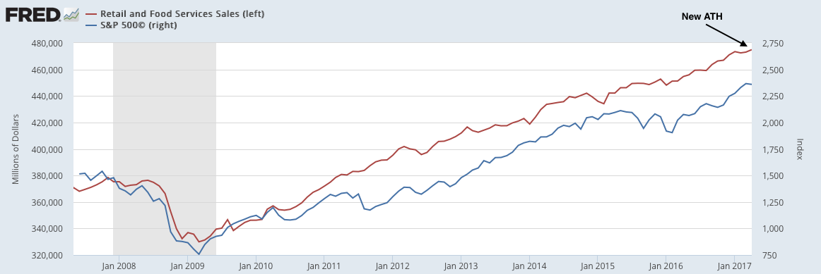
  • Most measures of demand show 2-3% real growth. Real personal consumption growth in April was 2.6%.  Real retail sales (including gas) grew 2.2% yoy in April, making a new ATH.
  • Housing sales made a 9-1/2 high in March. Sales grew 1% yoy in April. Starts grew 1% over the past year.
  • The core inflation rate is ticking higher but remains near the Fed's 2% target.
The main negatives have been concentrated in the manufacturing sector (which accounts for less than 10% of employment). Note, however, that recent data shows an improvement in manufacturing:
  • Core durable goods growth rose 6.0% yoy in April. It was weak during the winter of 2015-16 but has rebounded in recent months. 
  • Industrial production rose 2.2% in April, helped by the rebound in mining (oil/gas extraction). The manufacturing component grew 1.9% yoy in April.
Prior macro posts are here.

* * *

Our key message over the past 5 years has been that (a) growth is positive but slow, in the range of ~2-3% (real), and; (b) current growth is lower than in prior periods of economic expansion and a return to 1980s or 1990s style growth does not appear likely.

Modest growth should not be a surprise. This is the typical pattern in the years following a financial crisis like the one experienced in 2008-09.

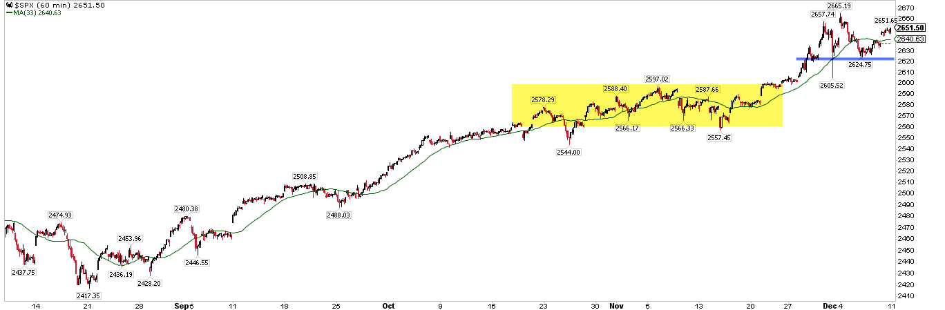
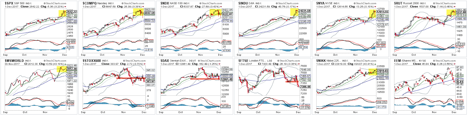
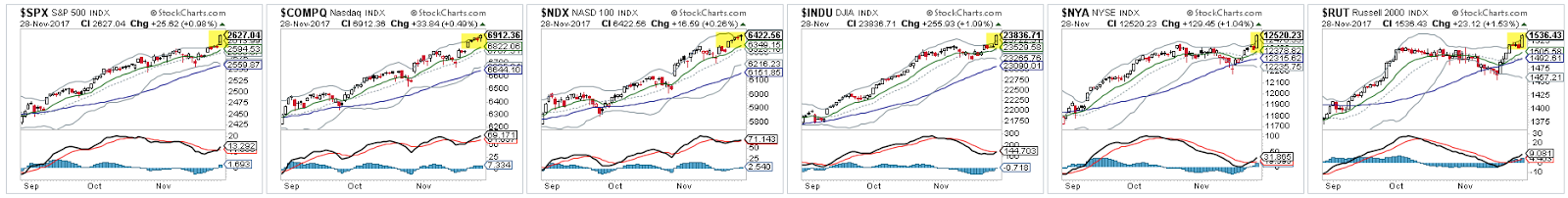
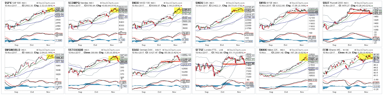
This is germane to equity markets in that macro growth drives corporate revenue, profit expansion and valuation levels. The saying that "the stock market is not the economy" is true on a day to day or even month to month basis, but over time these two move together. When they diverge, it is normally a function of emotion, whether measured in valuation premiums/discounts or sentiment extremes. Enlarge any image by clicking on it.


A valuable post on using macro data to improve trend following investment strategies can be found here.

Let's review each of these points in turn. We'll focus on four macro categories: labor market, inflation, end-demand and housing.


Employment and Wages

The May non-farm payroll was 138,000 new employees minus 66,000 in revisions.  In the past 12 months, the average monthly gain in employment was 186,000. Employment growth is decelerating.

Monthly NFP prints are normally volatile. Since the 1990s, NFP prints near 300,000 have been followed by ones near or under 100,000. That has been a pattern during every bull market; NFP was negative in 1993, 1995, 1996 and 1997. The low print of 50,000 this March, 86,000 in March 2015 and 43,000 in May 2016 fit the historical pattern. This is normal, not unusual or unexpected.


Thursday, June 1, 2017

Using Breadth To Anticipate Market Inflection Points

Summary:  When equity indices move higher, you will often hear commentators suggest the rise is suspect because leadership is narrow. "Breadth is lagging," "small caps are lagging," "breadth is diverging" or "the indices are lying because the average stock is underperforming" are common warnings.

It's conventional wisdom that new highs in the stock market should be confirmed by "healthy breadth." In other words, you want to see a large number of stocks in uptrends as the index price moves higher. Similarly, small cap stocks should outperform the relatively fewer number of large cap stocks as breadth broadens.

All of this sounds intuitively correct: a broader foundation should equal a more solid market. Conversely, a narrowing market should be a warning of a likely market top. This is how most pundits use breadth to anticipate market inflection points.

But there are two problems with this view on breadth.

Most importantly, the conventional wisdom about "healthy breadth" being critical for future stock market returns is empirically false. Indices have typically been driven higher based on a small number of stocks contributing disproportionately large gains. Over the past 20 years, just 4% of stocks have typically accounted for almost 70% of annual gains in the SPX.

Moreover, most market drops over the past 15 years, including those with declines of more than 10% or 20%, have started when 80-90% of stocks have been in an uptrend. In fact, over the past 5 years, the SPX has gained more than 3 times as much over the following month when breadth was weak compared to when breadth was "healthy." Risk/reward has been more than twice as favorable when breadth has been weak as when it was healthy. The conventional wisdom on breadth and future market returns has been exactly wrong.

The second problem is that stock pundits' views on breadth conflict with their views on investor sentiment.  Important market tops are defined by excessive investor bullishness: "everyone" is a bull by the end of a bull market. But think about what this means for breadth: if investors are bullish, they should be less selective about which stocks they own. They should seek to own the riskiest, highest beta stocks in the market. This means that market tops should be defined by broad, not narrow, breadth. By the time breadth is "healthy", investors are overwhelmingly bullish and the market tops.

No single indicator is sufficient in assessing market inflection points. Using breadth has serious drawbacks.  But this post suggests a far more logical and useful methodology for using breadth to anticipate market inflection points than "lagging breadth," "breadth divergences, " or outperformance by small caps stocks.

* * *

It's conventional wisdom that new highs in the stock market should be confirmed by "healthy breadth." In other words, you want to see a large number of stocks in an uptrend, trading above their moving averages, as the index price moves higher.

Yet, consider the following:
At the October 2007 peak in the stock market, almost 85% of stocks were above their 50-dma. The index dropped 10% in the next month and 50% in the next year. 
In April 2010, almost 95% of stocks were above their 50-dma and 200-dma. The index dropped 15% in the next two months. 
In May 2011, 80% of stocks were above their 50-dma and more than 90% above their 200-dma. Just three months later, the index was 20% lower and feared to be in a new bear market. 
These are not isolated examples where breadth was considered "healthy" and the index was near a significant top. Others are highlighted below. In the past 15 years, almost every significant market drop was preceded by an overwhelming majority of stocks in the SPX being in an uptrend. An exception was the initial 10% fall in August 2015. Enlarge any chart by clicking on it.

Sunday, May 28, 2017

Weekly Market Summary

Summary:  US equity markets made new all-time highs again this week. By Friday, SPX had risen 7 days in a row; that type of trend persistence has a strong tendency to carry the markets higher over the next week(s). While a period of higher volatility than what has been seen so far this year is odds-on, investors should not expect the bull market to be near an important top. Markets weaken before they reverse, and the existing trend has yet to weaken at all.

That said, the month of June is seasonally weak and there are a number of reasons to suspect it will be again this year, not the least of which is the FOMC meeting mid-month during which markets anticipate the federal funds rate will be hiked for a 4th time. The prior three rate hikes have coincided with notable drawdowns in equities (as well as a fall in treasury yields).

* * *

SPX, NDX and COMPQ all made new all-time highs (ATH) again this week. Including dividends, the DJIA also made a new ATH for the first time since March 1. The primary trend remains higher.

The new highs for the US indices were accompanied by ATHs in several large sectors: technology, industrials, utilities and staples. The consumer discretionary sector had its highest ever weekly close.  The healthcare sector is within 0.5% of its March high. Likewise, the very broad NYSE is just 0.2% from a new ATH. With 6 sectors and the NYSE at or near new ATHs, it's hard to say that healthy breadth is lacking.

Notably, SPX has now risen 7 days in a row. In the past 5 years, this has occurred only 5 other times, 4 of which were during the 2013 boom. In all 5 instances, SPX closed higher again within the next 5 days by a median of 0.7%. By Day 5, SPX was higher 4 of the 5 times.

For a larger sample size, consider the strong performance after SPX has risen 6 days in a row. SPX closed higher either 10 or 20 days later in 9 of 10 instances since 2012. Risk/reward (defined as max gain versus max loss) during the next 10 days and the next 20 days was 6 times. Clearly, trend persistence overwhelmingly led to further gains and favorable risk/reward (table from Twillo using data from indexindicators.com). Enlarge any chart by clicking on it.


Tuesday, May 23, 2017

The Worry About Indexing is Overblown

Summary:  Investors are clearly shifting away from actively managed funds to those based on index strategies. Only time will tell, but this has the look of a durable, secular change in investment management. But much of the perceived threat to market stability of indexing is overblown. Overall, the stock market is still dominated by active management. And while the number of index products has clearly exploded, 96% of these are of insignificant size.

* * *

Bloomberg recently reported that the number of indexes has exploded and now exceeds the number of stocks in the US.  Enlarge any chart by clicking on it.


Wednesday, May 17, 2017

Fund Managers' Current Asset Allocation - May

Summary: A tailwind for the rally since February 2016 has been the bearish positioning of investors, with fund managers persistently shunning equities in exchange for holding cash.

Fund managers have become more bullish, but not excessively so. Profit expectations are near a 7-year high and global economic growth expectations are near a 2-year high.  However, cash balances at funds also remains high, suggesting lingering doubts and fears.

Of note is that allocations to US equities dropped to their lowest level in 9 years in April and remain equally low in May: this is when US equities typically start to outperform. In contrast, weighting towards Europe and emerging markets have jumped to levels that strongly suggest these regions are likely to underperform.

Fund managers remain stubbornly underweight global bonds due to heightened growth and inflation expectations. Current allocations have often marked a point of capitulation where yields reverse lower and bonds outperform equities.

For the sixth month in a row, the dollar is considered the most overvalued in the past 11 years. Under similar conditions, the dollar has fallen in value in the month(s) ahead.

* * *

Among the various ways of measuring investor sentiment, the BAML survey of global fund managers is one of the better as the results reflect how managers are allocated in various asset classes. These managers oversee a combined $600b in assets.

The data should be viewed mostly from a contrarian perspective; that is, when equities fall in price, allocations to cash go higher and allocations to equities go lower as investors become bearish, setting up a buy signal. When prices rise, the opposite occurs, setting up a sell signal. We did a recap of this pattern in December 2014 (post).

Let's review the highlights from the past month.

Overall: Relative to history, managers are overweight equities and very underweight bonds. Cash weightings are neutral. Within equities, the US is significantly underweight while Europe and emerging markets are significantly overweight. A pure contrarian would overweight US equities relative to Europe and emerging markets, and overweight global bonds relative to a 60-30-10 basket. Enlarge any image by clicking on it.


Sunday, May 7, 2017

Weekly Market Summary

Summary: US equities rose for a third week in a row, to new all-time highs. Trend persistence like this normally leads to higher highs in the weeks ahead. It's true that volatility has dropped to significant lows and that volatility risk is to the upside. But timing this "mean reversion" is tricky: SPX could rise several percent before VIX pops higher. It's not a stretch to say that US equities have been focused on this weekend's French election the past several weeks; there is, therefore, a "sell the news" event risk to be on the watch out for.

* * *

Trend
  1. NDX and COMPQ made new all-time highs (ATH) again this week. SPX made a new ATH on a closing basis, eclipsing the prior high from March 1. The primary trend is higher. 
  2. SPX ended the week overbought (as measured by the daily RSI(5)).  Upwardly trending markets are partially defined by their ability to become and stay overbought. This is a positive sign so long as it persists.
  3. After becoming overbought, the rising 13-ema is normally the approximate first level of support on weakness. This moving average has not been touched in the past two weeks, a positive sign of trend persistence. That level is approximately 2380 (a chart on this is here). 
  4. SPX has now risen 3 weeks in a row. This is a positive sign of momentum. SPX has a strong tendency to make a higher high after rising 3 weeks in a row (blue lines in the chart below).
  5. All of the above said, markets undulate higher. Even the most persistent trends suffer setbacks, however temporary. The current uptrend is now one of the three longest since the low in 2009; if past is prologue, a 5% correction is odds-on by the end of June. That should be the expectation of swing traders heading into summer. Read last week's post on this here. Enlarge any chart by clicking on it.