The crack that opened in NDX two weeks ago has widened further. The index has now fallen 5% and has broken below its 50-dma. The consistent historical pattern is for SPX to follow, lower. That hypothesis is further supported by bullish sentiment - at a 3-1/2 year high by at least one measure - and the exceedingly tight trading range in SPX over the past month which most often precedes an expansion in volatility.
* * *
For the week, large cap stocks lost 0.5% while the Nasdaq-100 (NDX) lost nearly 3%. The volatility index, VIX, gained 11%.
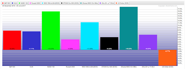
Equities have finished a very strong first half of the year. US large caps gained +8% while NDX gained twice that (+16%). Both of these outperformed the consensus long, Europe (+5%). But the best performing region to start the year was emerging markets, which gained an astounding +18%. Enlarge any chart by clicking on it.
Notably, US treasuries didn't lag equities by much, gaining +6.4% in the first half. That was better than small cap equities.
The US equity rally in the last 6 months was broad. Most sectors performed inline with SPX. Healthcare (+16%) and technology (+14%) outperformed while energy was the sole loser (-13%).
Including dividends, SPX closed higher for an 8th month in a row. In the past 26 years, the index has closed higher 8 months in a row only four other times. Three of those four closed lower in the next month; only 1995 continued to rise unabated (it eventually gained 10 months in a row).
Long gains in SPX have been bullish. Of the 10 prior instances the index has gained even 7 months in a row, the index was higher 3 or 6 months later every time. Over the next 12 months, the index was higher by a minimum of 9% (from @SJD10304).
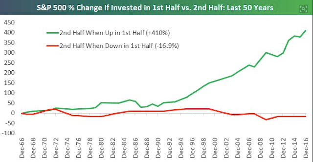
Similarly, strong starts to the year have been bullish for the second half of the year, which have gained more than 70% of the time (first chart; from Mark Hulbert) and have produced gains far in excess of those years when the first half of the year was down (second chart; from Bespoke).
The rise in equities is supported by the macro economic backdrop. Unemployment claims continue to fall; these will normally start to rise at least 6 months ahead of a recession (first chart). Likewise, home sales have gained 9% in the past year (second chart).
Moreover, the ATH in equities (blue line) is matched by the recent ATH in real retail sales (red line). The saying that "the stock market is not the economy" is true on a day to day or even month to month basis, but over time, these two move together.
For these reasons, we continue to believe that equities will see further gains through the end of the year.
While SPX gained in June, it was not a strong month for equities. SPX gained less than half a percent and NDX lost 2.5%. Objectively, the uptrend appears to be weakening and the set up for uninterrupted gains in SPX is softening.
The NDX made its most recent all time high (ATH) on June 8. It fell 2.5% the next day and has corrected a total of 5% since then. NDX closed below its 50-dma for the first time in 137 days on Tuesday - this was the longest such streak since 1995 - and has since closed lower two more days.
Our last weekend post detailed what weakness in NDX normally means for SPY (that post can be found here). The conclusion:
During the past 7 years, drops of more than 4% in NDX have always coincided with falls of at least 3% in SPY. That doesn't sound like much, but it would be the largest drop so far in 2017.
Closing below the 50-d after a long streak above has tended to mark the end of the persistent uptrend in which NDX either:
- Continues immediately lower, dragging SPY with it, or;
- Bounces (even to new highs) but ultimately gives all of those gains back and enters into a multi-month consolidation/retracement period.
- Since the mid-1990s, the only exception was in late-2013, where the index simply continued higher.
As an example, the chart below shows long streaks above the 50-d for NDX since 2010; the shading shows the period after the streak ended and the number above the shading shows the length of the streak.
To be clear, breaking below the 50-d is not a long term bearish development. It's true that the end of a long, persistent uptrend marked the exact top for NDX in March 2000, but in all other cases the index's bull market proceeded higher. Like other studies we have shared this year, the balance of evidence suggests any interim pause leads to further gains in the months ahead.
A good guess is that NDX will find initial support at it's mid-May low (near 5570; blue dashed line). If that fails, the long consolidation during March and April centered on 5400 should be very strong support (yellow shading). It would be normal for the index to then form a "base" before resuming its uptrend, as it did twice during the uptrend in 2016 (blue dashed boxes). The MACD (lower panel) will likely reset lower than today's level.
So far, SPY has barely corrected 2% despite the weakness in NDX. On Tuesday, for the first time since mid-May, the index closed below its 13-ema. As often happens, that led to a touch of its 50-dma and (so far) a 1% bounce. On it's own, the price activity in SPY is normal for an uptrend.
But repeated touches of the 50-d increase the likelihood of a larger break. A 3% correction targets the 237.5 area. That would equal SPY's 20-wma (blue line in chart below); after a long uptrend, that tends to be an approximate level of support (arrows). In this case, it also corresponds to the trading range during most of May (yellow shading in chart above and below). A larger break is more likely only after repeated touches of the 20-wma lead to failure (red shading in chart below).
2017 has been notably calm. So far, SPX has had a maximum drawdown of just 2.8%. In the past 89 years, only one (1995) had a smaller drawdown. The next smallest was 3.5% (in 1964) and then 4.4% (in 1954, 1958 and 1961). Since 1980, the median annual drawdown has been more than 10%. A more significant drawdown than the one to-date remains odds-on (from Charlie Bilello).
The relative calm in the market has resulted in the trading range in SPX contracting to one of the tightest in several years (lower panel). This has most often (just two exceptions in the past 5 years) preceded a spike higher in volatility (middle panel) and a pullback in SPX (top panel).
We have previously remarked that the uptrend in SPX is extended: the last 5% drawdown was in early November, 163 days ago. In the past 22 years, 173 days in 2006-07 is the only longer streak since the epic 296 day stretch in 1995-96. In short, these streaks can go longer, but that is a rarity.
A 5% correction from the recent high in SPY would target the 232.5 area, equal to the mid-April low.
We've been tracking the one-month weighted average equity-only put/call ratio in recent posts; it is at it's lowest since January 2014, meaning bullish sentiment is at a 3-1/2 year high. SPX fell 6% later that month. Even the unweighted ratio is at a level that has consistently coincided with a pull back of at least 3% in SPX, even during 2013 (red circles). Options traders have remained remarkably bullish despite a 5% drop in NDX in the past few weeks.
July is known for being the strong month during the otherwise weak summertime period (from Bespoke).
But context matters. Strong seasonality in winter typically follows weaker seasonality in summer. Similarly, the strength in July typically follows weakness in May and/or June.
The chart below highlights the month of July since the early 1990s. When July has gained (blue lines) it has typically been after a significant low in the market (green arrows) or after weakness in the prior months (yellow shading); in those few times that July gained anyway, weakness was quick to follow in the next month(s). At best, near term risk/reward is flat on a seasonality basis.
A final point on macro expectations, which started the year strong but have since fallen to the lowest level since early 2016. It's true that expectations are mean reverting, meaning that today's low expectations are likely to rebound during the second half of the year. Not surprisingly, this should be a positive for risk/growth assets like equities, and normally it is. But as the chart below shows, equities have not always done well when they are at a high while macro expectations are at a low, like now (red lines). In other words, rebounding macro expectations are not a slam dunk for equities in 2H17 absent some interim correction in equity prices (from Sentimentrader).
The calendar is highlighted by auto sales on Monday and NFP on Friday. Tuesday is a holiday and Monday is a half day.
In summary, the strong, uninterrupted start to the year for equities is very likely to lead to further gains in the second half of the year. But the crack that opened in NDX two weeks ago has widened further and the consistent historical pattern is for SPX to follow, lower.
If you find this post to be valuable, consider visiting a few of our sponsors who have offers that might be relevant to you.


